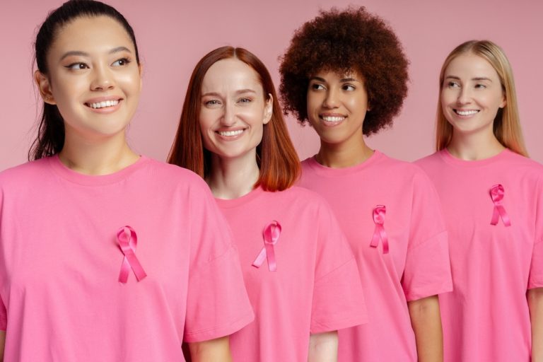
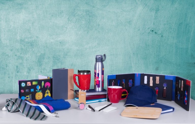
Top Promotional Giveaways For Charities
22nd August 2023
Probably the most used colour in branding, a safe bet for any brand. As it contrasts well with any other colours. Many designers will use white, as it gives a clean and modern look. You’ll often find websites have a white background, as it’s easy to read any text over and a colour that won’t frustrate the mind. It’s difficult to establish a brand just using this colour, make sure to pair it with another colour like blue or red.
Green is highly associated with nature, the environment and wealth. If you’re a charity that supports the environment you want to be using the colour green, in order to get your message across. Or if you’re a brand looking for a fresh start, green is perfect.
When it comes to branding blue is one of the most preferred colours used by companies. Associated with communication, reliability and peacefulness. Perfect for healthcare like the NHS is widely known for its blue logo. Make sure not to overuse blue as it can be seen to express sadness and appear detached.
Another popular colour in branding red is seen as a symbol of passion, playfulness and excitement. If you’re looking to stand out red is an ideal option.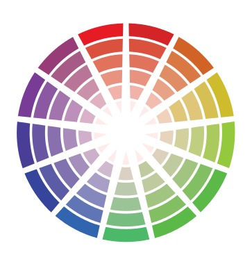
Top choice for high-end retail companies, purple is seen as a powerful colour, associated with luxury, royalty, and wisdom. Chocolate brand Cadbury is easily recognisable from its purple logo.
This warm colour is often used to associated happiness, energy, and positivity. A great colour for drawing in new customers. Used by big brands like McDonald’s, Ikea, and Snapchat. If you’re looking to create a positive impression of your brand, yellow is the colour for you!
Black is a colour seen as a symbol of professionalism and elegance, perfect for brands looking to make a more powerful statement. Like white, black contrasts well with any other colour. The BBC uses black in their logo, showing off how powerful they are in the television industry.
While colour psychology has been studied and analysed for years, personal preference plays a big part, and everyone will have different opinions on colours. Before creating a logo, take time to consider what emotions you want people to feel and how you want them to respond. In the end, it’s all about you trying to gain a deeper psychological connection with your consumers.
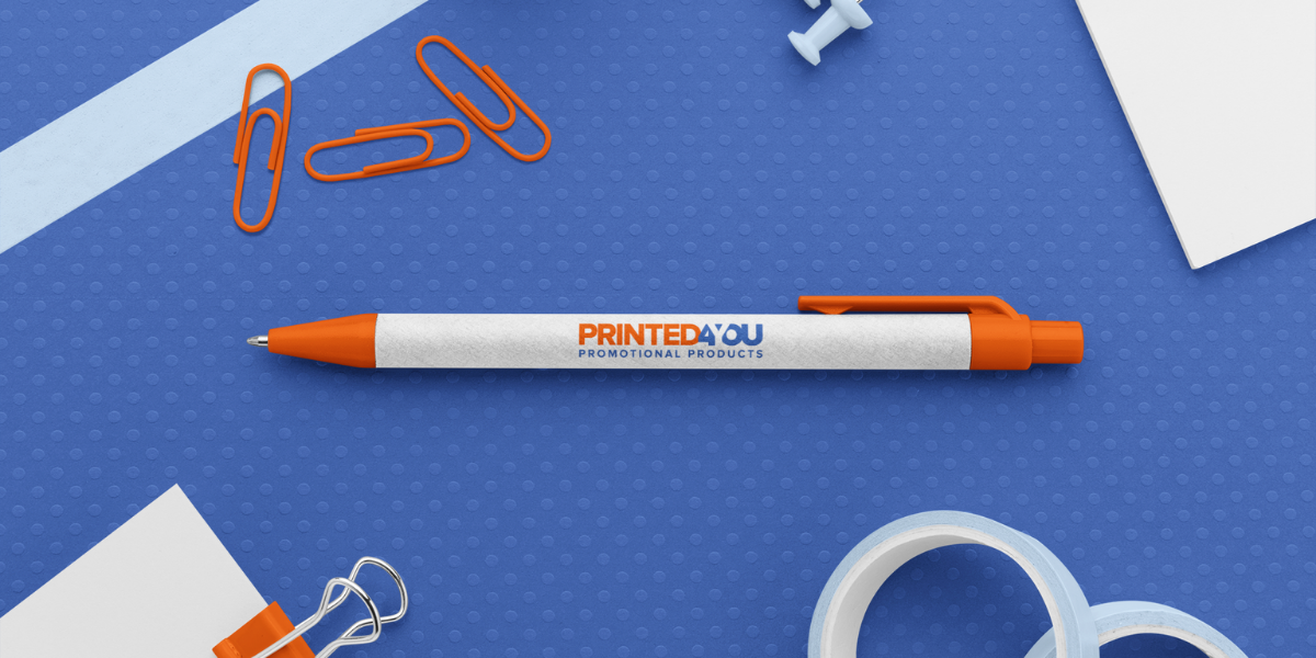
Browse our full range of promotional products here
➤Colour meaning and symbolism-canva.com
➤Colour meaning and psychology-graf1x.com
➤All about colours and symbolism-color-meanings.com
➤Colour meanings and the art of using colour symbolism-99designs.co.uk
22nd August 2023
28th February 2024
9th March 2023
7th October 2023
1st July 2026
1st April 2026
19th January 2025
1st May 2026

9th December 2024
9th March 2023